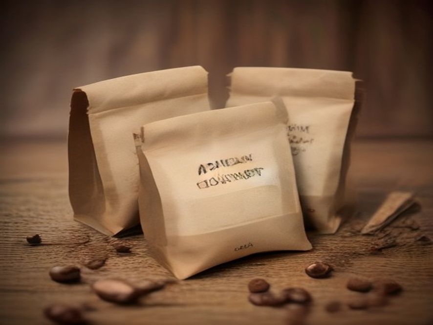
Packaging Design
From labels to flexible packaging, doypacks and shrink sleeves — one brand language across the whole family.
Packaging is the surface where your brand spends the most time with the customer. An ad lasts thirty seconds; packaging sits on the kitchen counter for weeks.
Designed against shelf reality
Packaging is never seen alone. We evaluate designs in a simulated shelf setup — right distance, right neighbours, right lighting.
Packaging family architecture
We design a system that can grow: colour coding, icon systems and typographic hierarchy that survive new flavours, weights and sub-brands.
Material and sustainability
Kraft and recycled board, mono-material flexible packaging, plastic reduction and correct use of recycling symbols.
Regulatory compliance
Mandatory information areas, minimum type sizes, allergen emphasis, barcode placement and export label variants.
What is included
- Packaging family and variant system
- Labels, doypacks, shrink sleeves and flexible packaging
- Shelf simulation and competitor analysis
- Mono-material and sustainable material guidance
- Legal information layout
- Export market label variants
- Barcode and ink optimisation
- Product photography art direction
How this project runs
Category and competitor analysis
The shelf is photographed and competitor colour codes are mapped.
Positioning
We determine which gap on the shelf the brand will occupy.
Design routes
Three distinct visual routes are developed.
Shelf test
The chosen route is judged from distance on a simulated shelf.
Family rollout
All variants and weights are adapted into the system.
Production and print
Production files are prepared and proofs checked.
From the studio

Packaging Design — FAQ
Answers to what clients ask most often before starting this kind of project.