

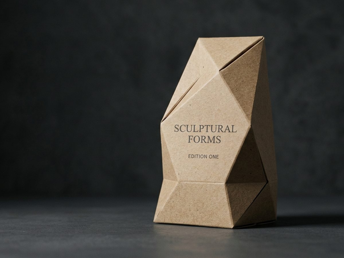

Material
SBS board
White, smooth board. Common for cosmetics and food cartons where vivid print and crisp detail matter.
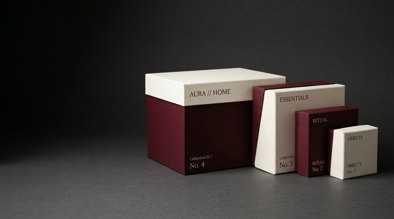
From the die-line to the shelf: structure, graphics, prototype and production files under one roof.
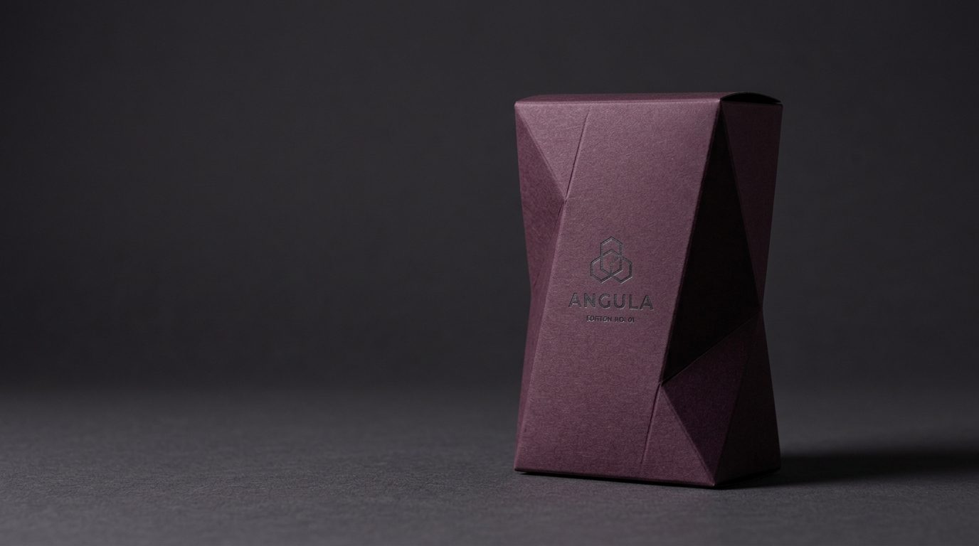
Lock bottom, crash-lock, sleeve, magnetic lid. Every structure is cut in board and tested by hand.
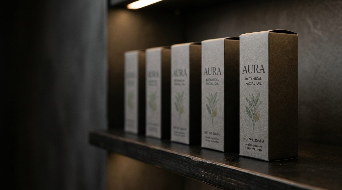
We judge design on a simulated shelf among competitors, not on a presentation board.
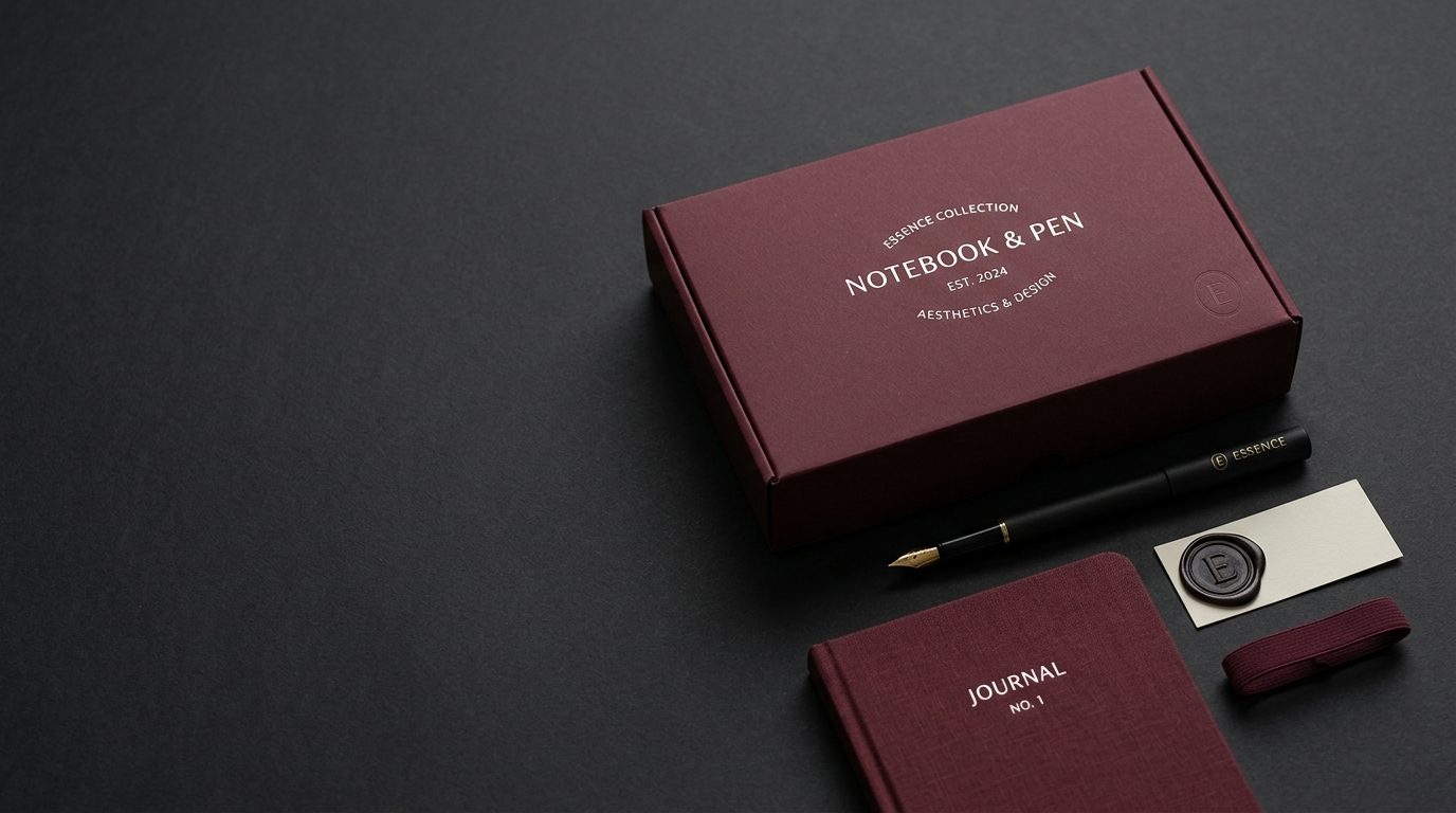
Colour, typography, iconography and application sets keep your brand consistent everywhere.
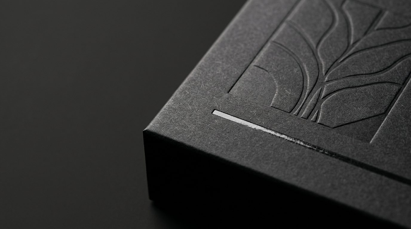
Colour separation, bleed, binding allowance and on-press proof approval are part of our job.
Most agencies place artwork onto a ready-made die-line. Structural design lives at the die-cutting workshop, graphic design lives at the agency, and the two rarely speak.
We do both. The way a box opens, how it locks, how much load it carries, how it stands on the shelf — these are design decisions, and we make them before a single pixel is placed.
Pick a box type and enter its size — the dieline is drawn to the millimetre. Design every face, watch it fold in 3D, choose material and finishes, and send it over for a quote.
Our priority is box and packaging design — but a brand rarely needs only one of these. We cover the whole system.
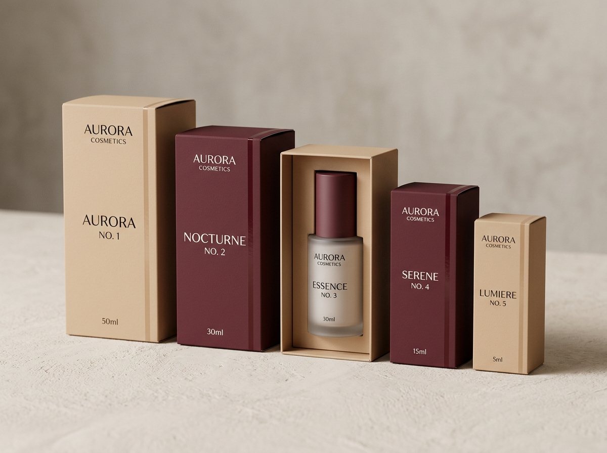
We design both the graphics on the surface and the structure you feel in your hand — from die-line to prototype, from proof to shelf test.
From labels to flexible packaging, doypacks and shrink sleeves — one brand language across the whole family.
From naming to logo, colour system and a full identity guideline that actually gets used.
Positioning, naming, architecture and tone of voice — the ground design is built on.
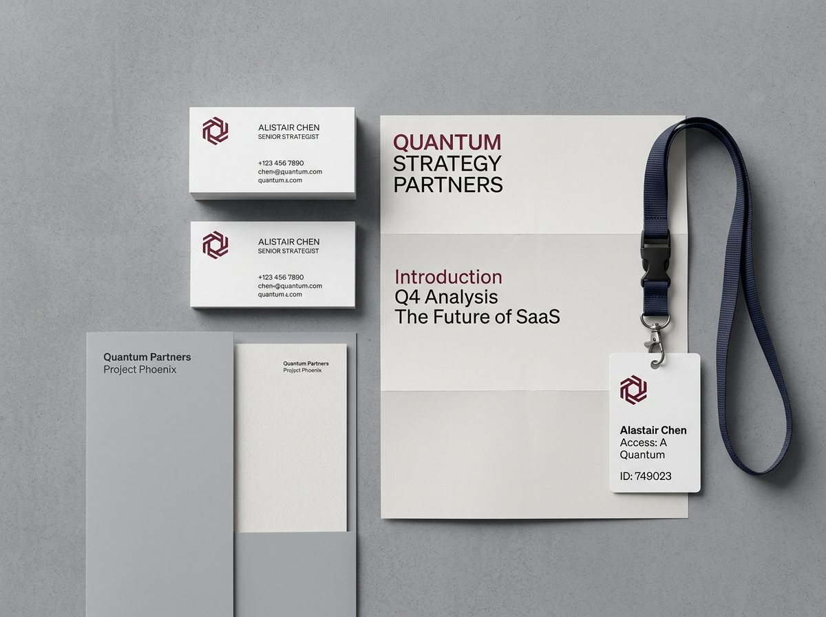
Product catalogues, brochures, annual reports, fair materials and POS items.
Social media design, digital ad sets, e-commerce visuals, product photography art direction and web UI.
Choose a professional template, type your details and adjust everything freely. Pick paper and finishes, send it over — we prepare the file for print and reply with a quote.
 View
 View
 View
 View
 View
The scope changes from project to project; the framework does not. You always know where we are and what comes next.
We measure the product, weigh it, study its sales channel and its neighbours on the shelf.
Die-line alternatives are drawn and hand-tested as cut board mock-ups.
Three distinct visual directions, evaluated on the structure rather than on a white background.
A 1:1 mock-up is produced and physically tested before anything is approved.
Die-line, colour separation, flat sizes and print instructions go to the printer.
The first proof is checked and approved at the machine.
We help you choose the board and finishes that suit your product, budget and brand — and say plainly when a finish is not worth its cost.
White, smooth board. Common for cosmetics and food cartons where vivid print and crisp detail matter.
Board with a white front and grey back. A more economical option; the inside of the box looks grey.
A natural brown look. Printed colours appear darker and warmer on kraft.
A thin fluted board, light but strong. Ideal for mailer boxes and can be printed inside.
Thicker fluted board for shipping cartons, with higher stacking and transport strength.
Rigid boxes made by wrapping thick board in coated or textured paper. Prestigious and long-lasting.
A thin film over the print protects the surface. Matt looks calmer, gloss more vivid.
Gives a velvety, silky feel. A favourite for premium cosmetics and gift boxes.
We got quotes from three agencies. They were the only ones who talked about the structure.
They showed us how three sizes could come from one die. The tooling savings exceeded the design fee.
For the first time our brand guideline is actually usable.

From lock bottom to magnetic rigid boxes: eight formats and when to use each.
A practical guide to die-line layers, bleed, fold lines and what printers expect.
Six concrete rules that work in the three-second attention window.
Send a brief through the form and receive a written proposal with scope, timeline and budget within one business day.